Case Study: Bliss Media Solutions
01 / Branding
Bliss Media Solutions was built on the idea of community, and has core values to empower small business, with a focus on women-led businesses. The company is made up of passionate, young, vibrant, inclusive, and diverse people who care about their clients. After our initial conversations we worked to identify brand attributes to apply to their logo mark as “Trendy”, “Playful”, “Community”. While femininity is a key aspect of Bliss Media Solutions, we felt it was important to maintain inclusivity, recognizing that not all of their clients are women-led businesses.
Brand Attributes
Trendy
Playful
Community
02 / The Logo
Font Details
Pacifico
Quicksand Medium
Bliss Media Solutions logo mark is a custom mark built on the typeface Pacifico. The lowercase B acts as a monogram and secondary mark for the logo to give playfulness to their brand in multimedia settings and visual identity distinction in small instances, like a website icon.
03 / Colour Theory
Let’s vibe with something a little more vibrant. The colour theory behind Bliss Media Solutions brand was to take their existing colours and refine them to work better for accessibility. Aside from finding some more vibrant colours they work well overlapped onto each other in most instances.
Primary
Violet
#E289F1
Secondary
Indigo Velvet
#402C89
Tertiary
Custom Gradient
#402C89
04 / The Website
The web design concept for Bliss Media Solutions focuses on translating their playful and community focused brand into a complete digital experience. As a vibrant social media and content creation agency, they needed a website that felt both authentic and highly professional. We built a website that mirrors the fun energy they bring to their clients across the Greater Toronto Area. The layout uses clear navigation and strong visual hierarchy to highlight their core services, including organic content creation, influencer marketing, and brand activations. By applying their accessible color palette and engaging typography, we crafted a site that captures their unique vibe. The final design provides a cohesive online presence that helps them stand out and connect directly with their ideal audience.
Outcome
Increase in organic traffic and lead volume by 400%.
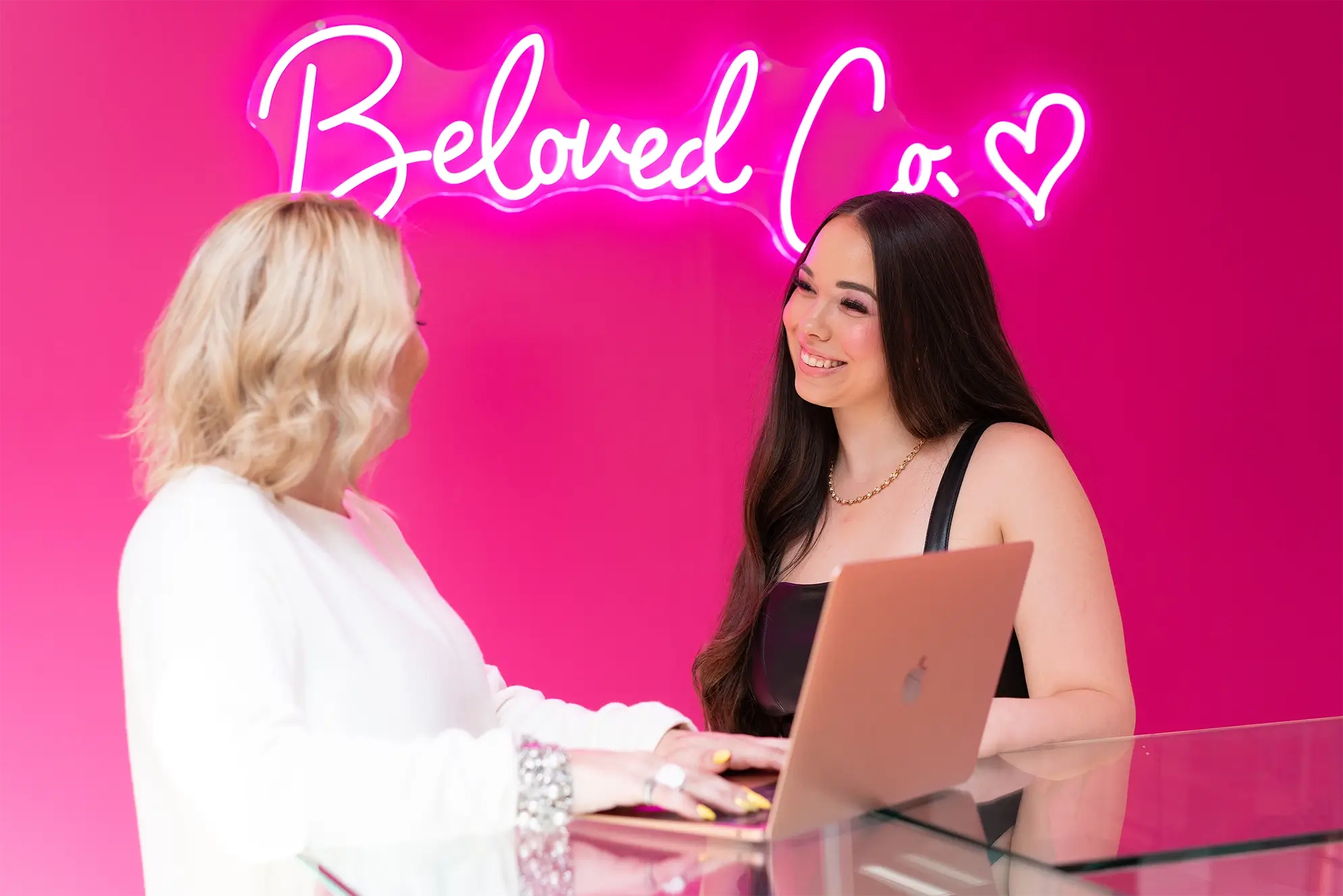
05 / Imagery
To capture the true energy of Bliss Media Solutions, we focused the visual direction on their team in action. Showcasing real moments of them coordinating shoots and engaging with clients highlights their active creative process. This authentic approach perfectly reflects their role as a dedicated partner for their community.