Started to help Canadian homeowners easily gain access to funds.
In Canada financial information is typically arcane. Get Mortgage Funding was founded on the principal of evening the playing field.
Started as a joint venture between a mortgage broker and The Falconry, Get Mortgage Funding was originally supposed to be for lead generation purposes but quickly evolved into a brand, and a website.
After our initial conversations the idea, while a little on the nose, comes from the fact that money literally does grow on trees.
Once the branding was in place the rest of the project relied on creating a customer journey that gains necessary information to start the lead generation process but simplified to not waste the end users time.
And finally, a content strategy was created help customers gain information in straightforward language.
Services Provided
Technology Used
Get Mortgage Funding was created initially as a lead generation pilot but quickly evolved into a brand.
Financial services can often be seen as stuffy, or dry. After our initial brainstorming session we identified an opportunity differentiate our branding by outlining the brand attributes as “Classic”, “Fun”, and “Modern.
The idea is maintain a professionalism while also being appealing to a younger demographic looking for information about finances.

Logo
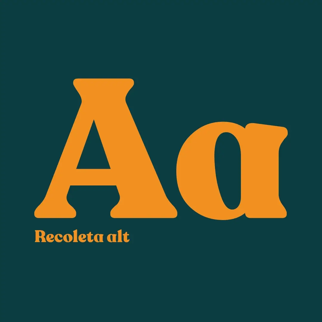
Get Mortgage Funding’s logo mark is a custom mark built on the typeface Recoleta Alt.
The money tree insignia is the heart of the brand also acts as a secondary mark.
This was a joint venture so we only created one iteration of this logo as we had 100% creative control over it.

Colour Theory
Tired of feeling blue when talking about finances?
When it came to colour theory for Get Mortgage funding we wanted to look to the past for our “classic feel”. The inspiration behind the font selection was “old money” and a common colour palette used for that aesthetic is Green and Gold. That is the inception of where the palette originated.
When thinking of a tertiary colour we wanted something that would blend well so we chose a lighter shade of green almost emerald.

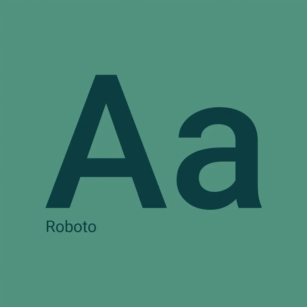
TYPOGRAPHY: The main typeface used on Get Mortgage Funding’s website is is Robot with Roboto Slab used for display fonts. When it came to their logotype we thought Recoleta Alt created the Classic feeling that we were hoping for, giving the wordmark an “old money” aesthetic.


For our website development we really leaned on our research of industry leading websites. Impressionism is the sincerest form of flattery after all. Also, people are used to applying for mortgages in a certain way and there’s no sense in causing friction or disrupting that process.
The aim of the website is to guide you toward our information to help users make an informed decision when choosing a mortgage. This is backed up by providing access to an Affordability Calculator.
This project didn’t have a lot of budget so when it came to sourcing images for the site we had to get creative. We leveraged royalty free stock with a candid photography style.
Get Mortgage Funding is dealing with sensitive topics of people’s homes and finances, so we generally wanted to use a softer approach to images, that represented family.


